Layout settings
For JormunTL 1.4.1
The homepage builder, site width, library, cards, list view, the novel page and the chapter reader.
The largest panel, and where the site gets its shape.
Everything here is in Appearance ▸ Customize, which previews as you change it. Nothing is saved until you press Publish, so it is the safe place to experiment: change something, look at the preview, and close without publishing if you hate it.
Each picture below is that section’s own pane, breadcrumb included, so you can see where you are.
There is a shortcut. While you are looking at the site signed in, hover Customize in the bar at the top: the menu lists the sections for the page you are on (Novel Page, Novel Cards and Ratings on a novel; Library Layout, Novel Cards and Novel List in the library; Homepage Layout, Header and Footer on the front page). Clicking the button itself opens the Customizer at the top level, as it does on any WordPress site, which is where Colors and Typography live.
Homepage
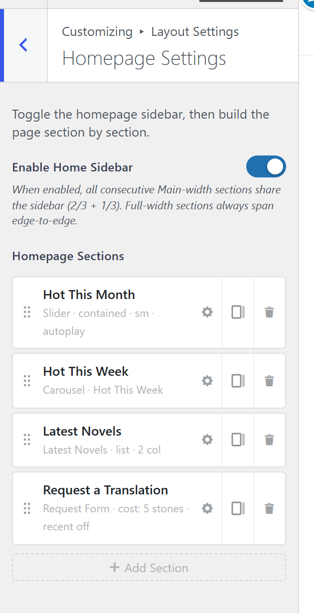
The homepage is built from sections, not from a page. Add the ones you want, in the order you want them.
A small site needs two: something featured at the top, and Latest Chapters. Add more only as there is activity to fill them, because a carousel with four entries reads as an empty shop.
Sections worth knowing:
- A slider or carousel at the top, for featured novels. What is featured is a switch on the novel itself; see adding a novel.
- Latest Chapters, which is what update-driven sites live on.
- Latest Novels, for library discovery. Its Order is latest added, the newest novels on the site, or latest updated, the novels whose newest chapter went up most recently. A site that posts chapters daily to a handful of long novels wants the second: the first would show the same novels for months.
- Hot This Week and Hot This Month, which need enough reading activity to mean anything at all.
- A request section, if reader suggestions are part of how you choose what to publish.
Sidebar on the Homepage turns on the column beside it, filled from Appearance ▸ Widgets ▸ Homepage Sidebar.
Layout Width
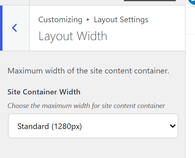
Site Container Width. Narrow suits a text-heavy site; wide suits a large library where the grid is the point.
Library
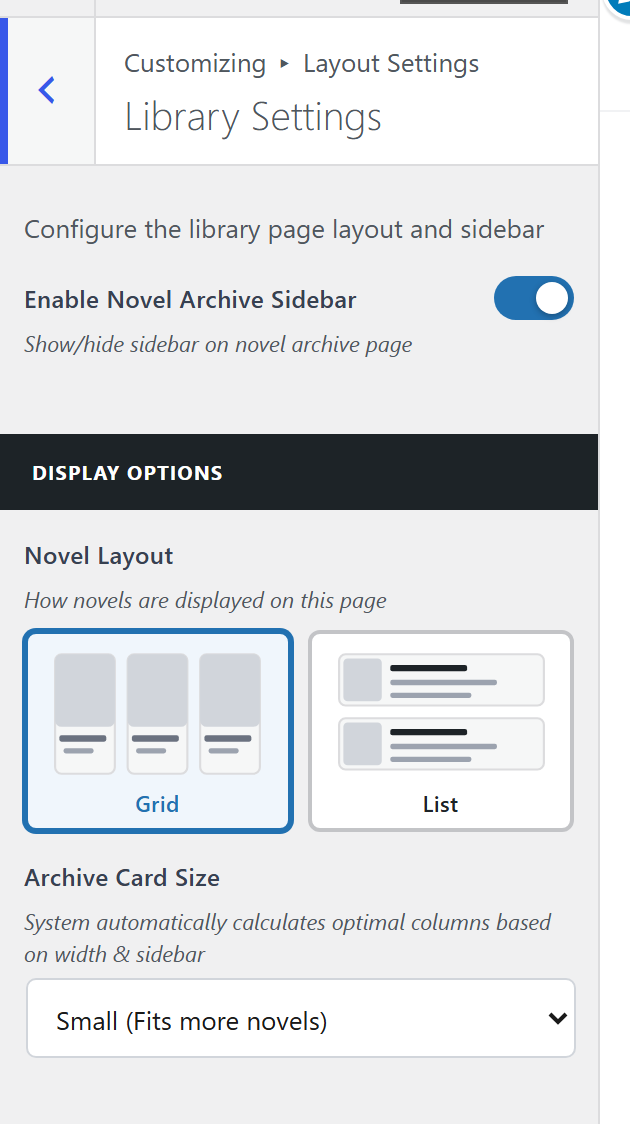
How the library behaves: the All Novels page and every genre and status page. Default Sort is the order it opens in: Recently Added (newest novels first), Recently Updated (newest chapter first), A to Z or Highest Rated. A site that posts chapters daily wants Recently Updated. Readers can still change it from the Sort menu on the page. Novel Layout is grid or list, Card Size how large the cards are, List View Columns how many columns list view uses on a desktop, and Sidebar on the Library turns on the column beside it.
Display Options decides whether readers can switch between grid and list themselves.
Page Layout
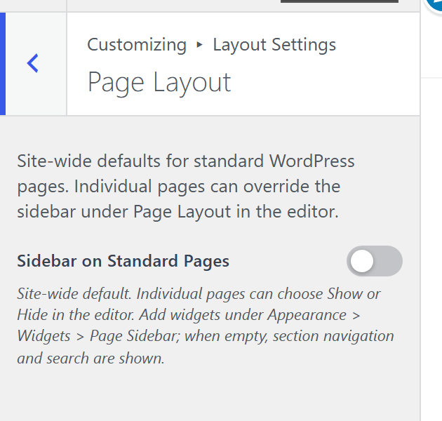
Sidebar on Standard Pages, for your About and similar pages.
Blog
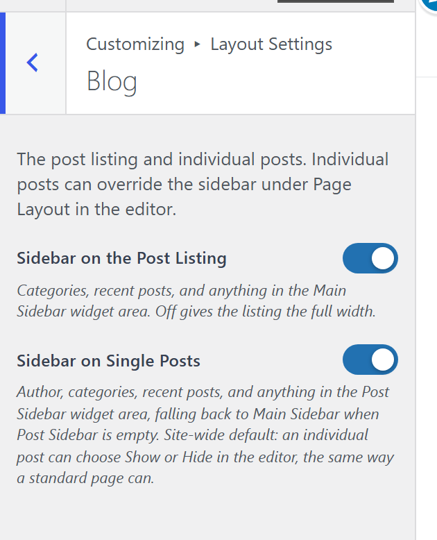
For sites that also run ordinary WordPress posts alongside their novels.
Error & Empty States
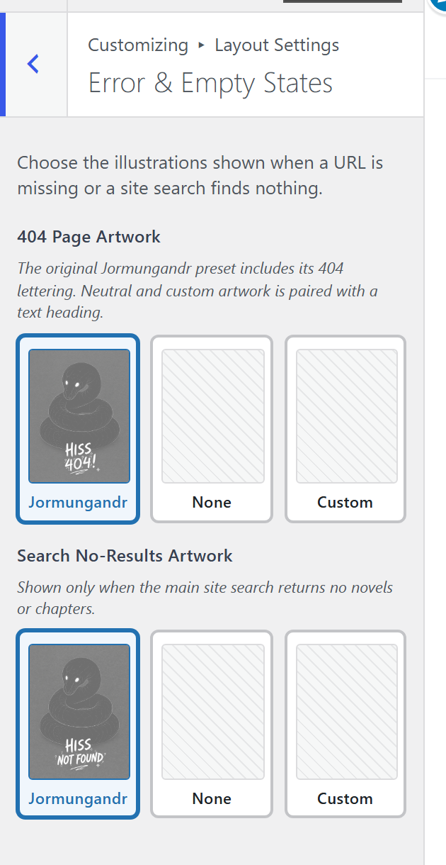
What a 404 and an empty search look like. Custom 404 Artwork and Search No-Results Artwork take your own image, or use the shipped Jormungandr.
Worth setting. These are the screens a new site shows most often, and a default one is a wasted chance to look like a site somebody built.
Novel Cards
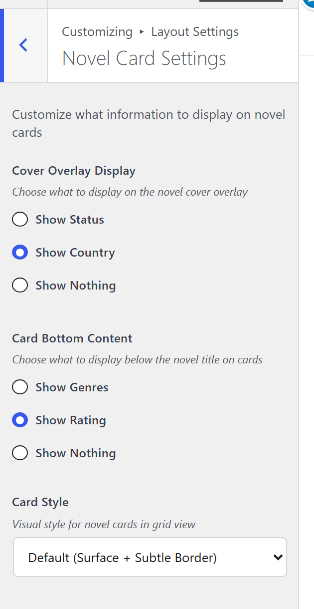
What a card in the grid shows. Every extra badge is information for one reader and clutter for the rest, so choose by what your site is:
- Cover Overlay Display: status, country, or nothing. Status for update-driven sites, country for translation libraries.
- Card Bottom Content: genres, rating, or nothing. Genres for discovery, rating for review-driven sites.
- Max Genre Tags caps how many fit before it stops.
- Card Style is the visual treatment.
If your library seems to be missing status badges, this is why: the overlay is one slot and it can only show one thing.
List View
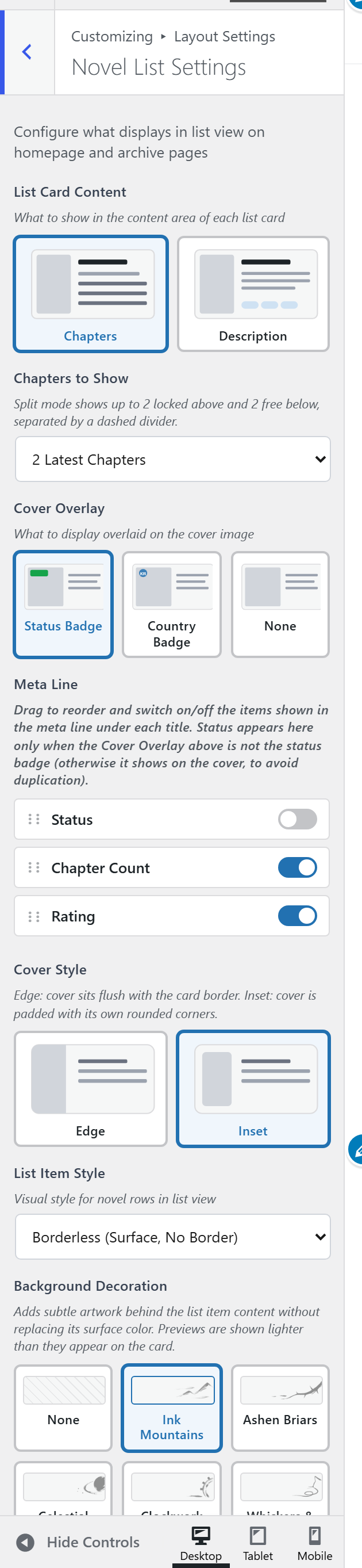
List view suits large libraries and readers comparing by metadata. It can show recent chapters, a synopsis, rating, status, chapter count, genres and a cover overlay, and the Meta Line decides which of those appear and in what order.
Novel Page
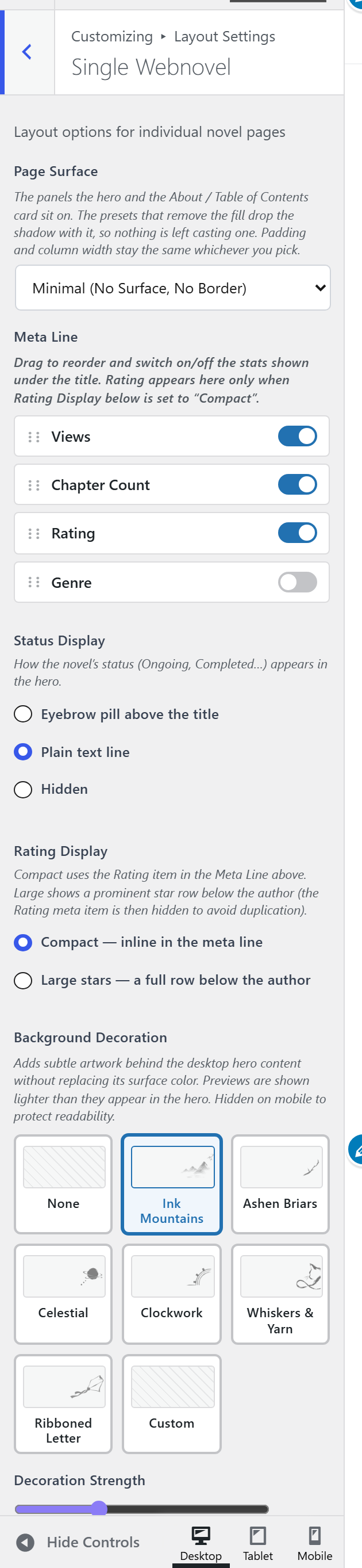
The page every novel gets: the card at the top, the chapter list under it, and the sections below that.
Hero Layout comes first, because it decides the rest.
- Classic puts the cover on the left, the facts on the right, and the synopsis behind an About tab.
- Storefront stacks the reading buttons under the cover and keeps the synopsis in the card. On a desktop it also puts the chapter list beside the cover, and the cover and buttons follow the reader down the list. It is the arrangement a site selling chapters wants.
- Quiet shows few numbers and lets the synopsis carry the page.
The hero
What the card shows is where each fact sits. The card has four places: above the title, under the title, the stats line, and Details. Each fact, such as Status, Author or Views, sits in exactly one of them, so nothing prints twice. Drag to reorder, click × to remove a fact, and use + Add to bring one in, including from another place. Reset returns a place to what the layout does, and Not shown lists what is currently left out. The stats line can be Roomy or Tight, and Details can be Rows (label and value on one line) or Columns (a compact row of stats with a thin line between them).
Offer signed-out readers an account adds a small line under Continue Reading suggesting a free account, so a reader’s place follows them to other devices. Turn it off on invite-only sites.
Below the hero
Synopsis chooses between the card and the About tab. It shows for Classic and Quiet only; Storefront always keeps the synopsis in the card.
Chapter list columns is one column or several, and several suits a novel past a hundred chapters. It hides for Storefront, whose list beside the cover is always one column. Chapter list navigation decides how a long list moves: every chapter at once (small novels only), a Load more button, page controls, or whatever the site uses under Lists and navigation. Chapters per page sets the size of each step. A novel split into volumes is paged by volume, so a reader always sees the whole shape of the book.
Page Sections orders what comes after the chapter list, and where each one goes: in the page, hidden, or, for Reviews, as a tab beside Contents.
You May Also Like: title, which novels and order drive the related novels row: the same genre or any novel, ordered randomly, by views, by rating or newest first. Picking related novels by hand is done on the novel itself; see adding a novel.
Artwork & surface
Page Surface is the panel the card and the chapter list sit on, from a filled card with a border to no panel at all. Background Decoration, Custom Artwork and Decoration Strength are the artwork behind the hero, with a switch for inverting custom artwork in dark mode.
Chapter
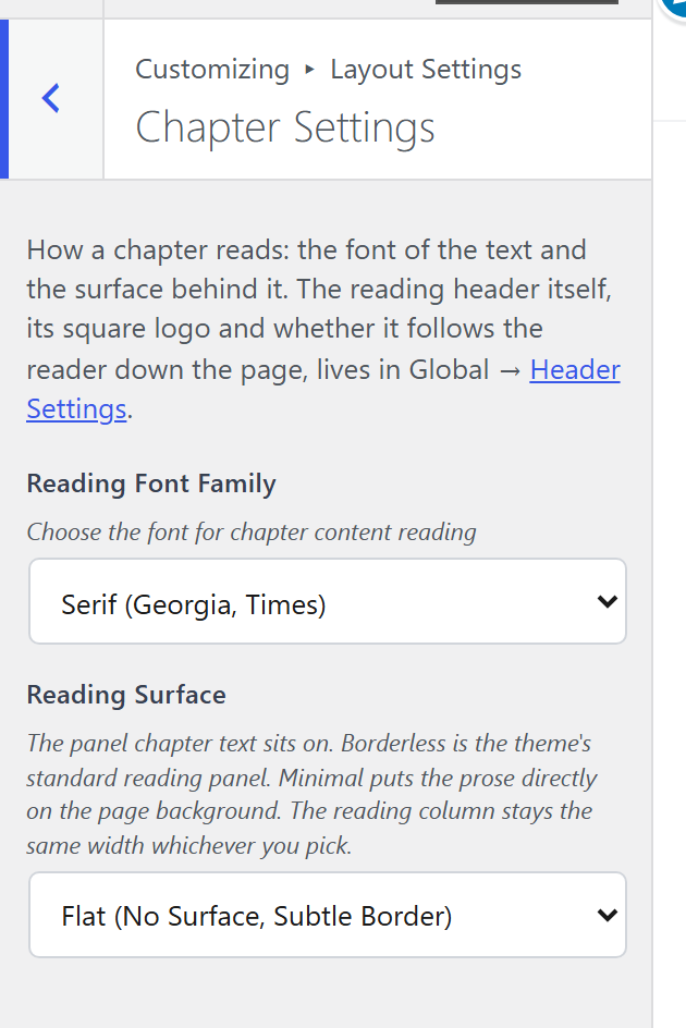
The reader itself. Reading Font Family and Reading Surface are the two that matter, because a reader spends hours inside them and minutes everywhere else on your site.
Change these with the preview showing a chapter, not the homepage. The homepage is the page you look at; the chapter is the page they look at.
Something here wrong or missing? jormundevtl@gmail.com
Privacy ·